A website dedicate to games of all favors and varieties, from video games to good old D&D.
Monday, May 29, 2023
Production Progress
Monday, May 17, 2021
Tinkering Again With Artwork
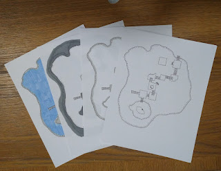
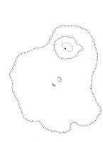
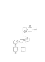
The Kobolds accessed the Folly from a cave system below. I find that the style of Worldographer is not up to the task and I am looking for an alternative style. It's wonderful for producing battle mats and large scale maps, but not so hot with cave systems.
I'd like the base the system of caves on Carlsbad Caverns. I've been reviewing maps and brochures of the place for weeks. The cavern under the Folly is much smaller than Carlsbad Caverns.
I've also been looking at the art in DMGR1 Campaign Sourcebook and Catacomb Guide. This book is one of my favorite's even though it's technically e2 D&D. At the time of e2's launch, I didn't realize that it was a revamped system and was using willy nilly in my AD&D campaigns. I love the isometic projections in this book and would probably want to copy that style.
Friday, April 30, 2021
Posing
Wednesday, April 21, 2021
New Logos
Many years ago, I decided every post needed some artwork. It's more interesting that way. The other day, I decided that all series need a logo. I have only three built, but here they are.
Wednesday, April 7, 2021
Inspiration
This creates a cycle were the player was introduced to the module, then they presented the module as a DM to replay. The story gains additional replayability through this introducing it to others. I can repeat by placing a twist on the source material so that it is disguised. By the time you have your own kids, you see the cycle start again. It is very much like some beloved concept such as drawing, woodworking, camping, Disney, etc. to be passed down.
The activity is the same, but different depending on where you are in the cycle. This naturally leads to the idea of maps, guides, handbooks, t-shirts. I find it amusing that there could or would be some sort of insignia, brochure or mission patch for an old module because the are simply loved and repeated.
That is the source of inspiration for these images and my love of the OSR.
The difference between 6 and 10 is not very great in terms of time, so I recall my bedroom decorated with classic Disney posters, 60's and 70's baseball pennants and other object de art which were done in these odd colors and styles. It's no wonder that I have associate these images with those conjured by D&D.
Tuesday, April 6, 2021
Saturday, March 27, 2021
Outlining Ideas
Here is what I have been up to the past few days. I'm working a lot, so I don't have that much time.
Today, I burned a bunch of time reading blogs, 3 Toadstools mostly. This week on 3 Toadstools he revisit's a favorite of mine, Isle of Dread. 3 Toadstools came up with this great tool for campaign building, where you select 10 monsters and run with them. He has a list of categories here. It's a great read and simplifies worldbuilding.
Anyway, I am getting ready to return to my Peninsula of Plenty campaign, but modifying it to be a hex crawl. You probably noticed I have thinking about hexcrawls a lot. I have Filling in the Blanks scheduled for my next review, but haven't done it because I've been reading and rereading it for ideas for this new campaign style. I have to get both of these done as Into the Wild will be out next month.
What I have had time for is sketching. I like to do paper plans for new ideas in Inkscape. I am also tinkering with a new display format for images. Ideally, all images will be the same size so the page doesn't jump. This will be the case with my photos of models, but harder to do with drawings. It's a start.
Thursday, March 25, 2021
From the Sketchpad
 |
| Benny disapproves |
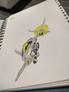
I do have this thing for retro designs using a very limited color palette, so I am burning these markers up to make rough drafts for my Inkscape work. The work is quick and very loose, as these are just rough ideas to keep my hands steady and moving. Use it or loose it.
I'll probably redo these a couple of times before they graduate to something I do digitally. The whole digital thing is also new to me, so I need to practice, practice, practice. Inkscape is my go-to tool for digital work. I like the ability to make geometric designs with bold colors.
I'll probably have a few more later tonight and tomorrow. I'm in training for the week, so it's natural to sketch while taking notes. I've seen any number of designs by Disney artists like this and you'd be correct if you thought I was dying to get back to an Amusement Park soon. Disney is out for 2021, but Six Flags is more doable.Wednesday, March 24, 2021
Teaser Art - Working with Pros.
Sunday, March 21, 2021
Jendart - The Not Review
I've mention how many times I've been sucked into a document because of the artwork. Simon Miles, Todd Leback, and now jendart.
 |
| Screencap of the artist on Jendart.com |
 |
It's the floating angles and the capture of the hex crawl ideal. The first product I saw was Hexcrawl Basics. I just love that this image is a map and landscape from the air. It's not avant garde or experimental or any other fancy thing, it's simply perfect for the book title. Everything you would wonder about "Hexcrawl Basics" is summarized in the image. Click the link to check it out on DriveThruRPG. There are interesting locals like the focal point keep and the walled town, plain areas and the sky above it all, with no edge to world as everything fades at the horizon.
That is pretty much "Hexcrawl Basics" in a nutshell.
The next title is "Filling in the Blanks" and I am sure you can see why I mentioning this one. I'm going to do a review and I want to get my admiration of the cover out of my brain before diving into this book.This image I like for a completely different reason. It reminds me of the comic book artist, Pablo Raimondi. Back in the 1990s, he had a quick, savage style which he lent to the covers of X-Factor. He went for impossible angles and clear cut actions.
Jendart's handling of the image captures nearly everything from the Hexcrawl Basics title while also embracing whimsy. I love the viewing angle above the characters in the foreground. While it isn't a one for one match with Pablo Raimondi's cover art, I can see that sort of see the "capture the moment" aspect in it. Even though we can't see the heroes' faces, there is a clear sense of wonder in their poses.
EDIT 2: I have been misspelling the name of the Jendart website in maybe 3-5 posts. I am so sorry and embarrassed. Because of the way blogger works, this mistake shall ever be memorized in the links which cannot be changed. Ugh.
Wednesday, February 3, 2021
Ooo... Shiney.
I'm stuck in mainatence mode right now, I'm cleaning up the basement and getting ready for my spring Model series while trying to figure out where my campaigns are going. I have to decide if we are doing Star Wars or D&D tonight. Since the players are the same, I guess it doesn't matter.
It's a good thing it doesn't matter because I had to take a spin to Hobby Lobby for a model and Home Depot for a shower head. One of those was more important than the other, but both where wiped from my mind when I found this excellent R2-D2 ceramic figure my grandmother made for me.
Tuesday, January 19, 2021
Updates - New Podcast Episode and More.
It's kind of funny, but I started this podcast with a mistake. I was thinking about podcasting and was shopping for microphones and trying out new software. Someplace in that process, COVID hit and the only way I could get art supplies was online. I placed an order with Amazon without noticing that I place a microphone into the cart instead of my wishlist.
I could of sent it back, oooooor I could make something with it. That mike has served me well over the past year, far more than just a podcast.
I used it for my zoom classes, both the classes I taught and the classes I took in school. I also scored a new job using that set up. The mic is hardly used for the podcast at all but it's been a life saver.
Rather than spamming it up with multiple posts, I've been drawing again with some new markers. I'm trying to get the hang of really simple sketches. I'm having probables balancing line weight with proportions.
 |
| The ill-proportioned horse. |
 |
| A better try. |
 |
| Needs shading. |
 |
| My nemesis. |
Monday, January 11, 2021
It's Here! This Artwork Now EXISTS!
However, I was determined to make it work. I started over with oil paint and hit another dead end. Finally, I took it digital.
The first iteration didn't work either. Then I stumbled across a couple websites: Thisartworkdoesnotexist.com and Deepart.io. Switching back and forth between the two, with a little image manipulation on my end, I finally got it right.
But how to get that tiny file out of the computer?I was just going to print it out at Walmart or Walgreens, but it didn't look right. Then I found Fractureme.com. It took a couple weeks because I ordered in the middle of Christmas and New Years.
Fracture prints on glass, an artform that when done by hand is mind boggling difficult. Completely beyond my skills. I am not sure how Fracture works, but it looks great. No frame required and all of the mounting hardware comes with it.
I think I am going to have to do this again.
