Showing posts with label Inkscape. Show all posts

Monday, February 13, 2023

Inkscape for Rapid Mapping

The other day, I posted this picture of a castle and lamented that I didn't have a map. 

With Inkscape, it's easy to do a map or at least block out areas for a map. 

I took the photo and imported it into Inkscape. My next step was to decide what size I wanted the image to be. I picked about 8.5" by 11". This gives me all of the white space around the castle to build the exterior areas which might be important to the user. 

So, how does Inkscape help build a map from a photo of a drawing? 

Geometry. 

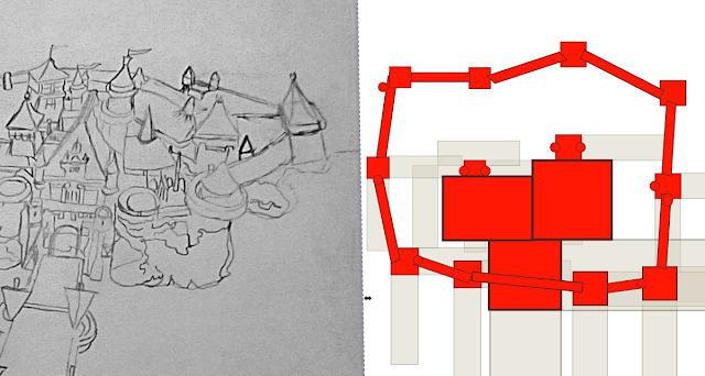
My first step was to make a series of rectangles the same size as the tower bases in the image. As I did each rectangle, I duplicated it and turned the duplicate 90 degrees. I did not adjust for the depth-wise adjustment of the towers. I could have but didn't want to make it too complex. 

The corner of one rectangle met the corner of its duplicate, leaving an open square. Once I had done that for every box, I tried to do the same for the central palace-like area. 

Once I was done, I put a red box or rectangle in that open space between the two grey rectangles. This allows me to map out a proportional arrangement of the structures with no measuring of anything. I deleted the grey rectangles and roughed out the walls between the towers. This is far from a perfect match, but it is very close. 

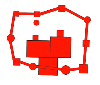
On the right-hand side of the map, you can see that I moved one tower very significantly. I just thought it looked better. Also, the drawing shows a series of buildings that divided the structure in half. I removed them so there would be an open space inside. 

Of course, some of my towers are circular. I simply replaced a few squares with circles. The trick here is to make the circles slightly larger than the squares they replaced. 

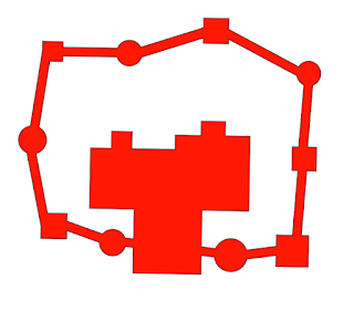
The final step was to connect everything together using the Union tool. 

In some cases, I think I made mistakes. The two front center towers are far less imposing on the map. In other cases, I ran the union process only to realize the pieces didn't mesh up, and I had to undo it so I could make adjustments. 
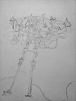
This is far from a perfect process, but it's good enough to get a general idea of the arrangement of the map. Later, I will dress up the Castle and then cut it back to show levels and interior spaces. 


Tuesday, December 22, 2020

Towers - Tiny Maps

I started drawing a few towers this week. They came out pretty well.

The first is a 35 foot tall tower, meant to be placed on exterior wall. The exterior is on the left and the interior of the walls is to the right. The first floor has no windows, just a door. The door opens inward while a pair of barred doors open outward. 

I haven't filled in the walls because I don't know what pattern I want to use. The walls are tapered from bottom to top so this is not a good design against siege engines. The bottom might hold, but the top could be collapsed by catapults. 

I drew no interior designs, not even stairs, so I can adapt them for different purposes. 

The next tower is 55 feet tall. Again the walls are tapered. This design is basically the same as the tower above, except the barred doors open inwards.

I like the details on the doorway at ground level, except I made a mistake. The scale in the profile view is one square equals 10 feet, while the side view is one square equals 5. The door is a massive 10 feet wide. As you can see from the tiny doodle on the upper right, I tried to fix that by making the door multifunction with two sally doors.

Additionally, I didn't like the way the windows looked. I changed styles and neither one looks very good. Plus, with the tower being so tall, there has to be a way to reach the walls. 

That won't do, so I decided to redraw it.  
In my third iteration, I came up with some ideas I liked such as the door leading to the top of the walls on the 4th level. I forgot to fix the door on the first level. Actually, this is the point where I realized the door was so big. I added some arrow loops next to the ground floor door. 

I think that I can fix the door digitally, but maybe I'll just redraw that level or the whole tower tonight. 

I really like this design and I'll use it to work up some designs in both Inkscape and Worldographer. 


Monday, August 31, 2020

Devil Fish Freighter - Background Information and Crew Notes


Yet, another ship, this time based on the 1977 Traveller rule set. This is a 400 ton freighter. The Devil Fish is a converted warship. As a warship, it was horrible. It was meant for planetary bombardment, but it lacked the fuel pods shown on this refit. It had just enough fuel for 2 jumps and 2 hours of operations. You could end up trapped in a system you just bombarded. None of these ships saw combat, thankfully. 

This freighter version is outfitted with larger fuel tanks which is slightly more practical. The two long beams are where the missiles used to be. In the refit, these long tubes were simply sealed up. The crew calls them "Industrial Accident Site, Port and Starboard", because they lack the funds to put anything in there. It's a long open chamber, completely devoid of any safety features. There is a brass sign with the names of 5 crew members who have been killed and a longer list of names of people merely injured. 

While creating the files for this ship, I made a typo that made me think of an interesting crew feature.

The current crew likes to gamble and won big at the table. It turns out the other gambler didn't actually have all of the funds to support his bet. In lieu of cash, he had a guy who could get the crew name plates for the ship, matching leather jackets and jumpsuits plus some extra patches, complete with names and logos for the ship.

Unfortunately, the crew thought he was faking an accent but he wasn't. Instead of logos with a manta ray logo and the name "The Devil Fish" they got a green devil's head and the word "Devilish". 


Since the ship is registered as "The Devil Fish", mistakes have been made in the crew's favor. Such as escaping security and not paying for goods loaded on board. The name plates are visible only when the airlocks are closed. They objected at first, but once they realized what was happening, the merely hate these details with a passion. It doesn't stop them from using them to run hustles and scams.  

It's such a strange detail, it sounds like it could actually happen. 

Edited - to add the Military variant, with no tanks. 


Friday, April 10, 2020

Inkscape again - Fighters on the Horizon

I'm still tinkering with that limited color pallet and funky looking ships.

I like the design, but need to fix the colors.


Thursday, January 9, 2020

The Troubleshooting (artwork) Post

I've been messing around with svg art using Inkscape. For whatever reason, when I upload these images they look fine on a desktop device, but are dark grey on a black background on mobile devices. I think I either uploaded some .pngs or perhaps forgot to flatten the image when going to .jpg.

Anyway this a test of 2 Skimmer ground cars.


These are 3 Greek soldiers. 


These figures have been a part of my Strictly (Duke) Springer posts, which I hope to fix soon. 


I'd like to scale them down to 1/4 and 1/2 sizes for counters.