A website dedicate to games of all favors and varieties, from video games to good old D&D.
Tuesday, December 20, 2022
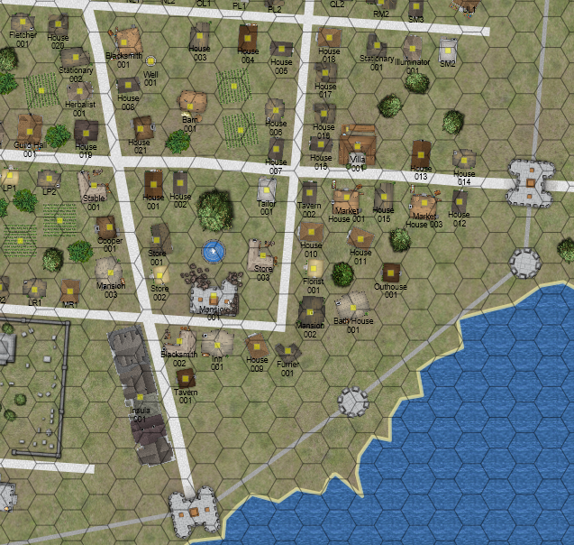
Expanding the View - The Town of Manteva
Wednesday, May 5, 2021
Lighter Reading - What I Do on Wednesdays
I'm reading for my next couple of reviews. I like to print stuff out for reading. Today, I fired off The Lake of Abominations -- Hex 17.23 by Third Kingdom Games (Todd Leback) to the printer. Since I have Mr. Leback's Into the Wild coming in the mail, I was going to use this as a model for a hexcrawling module.
Yeah... I don't know about a hexcrawl module, either.
Anyway, this funny thing keeps happening. My printer insists that blue is a grey scale color.
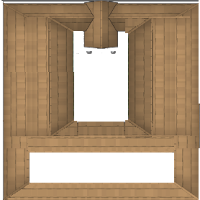
I also have a third idea for a map of Miledown, another setting placed in the middle of my Peninsula of Plenty map. Miledown is a small town in a valley. I already have the cover art ready to go. It's just a matter of writing... you know... a description, a story and an adventure.
Little things.
 |
| Let's hope this comes out less phallic looking. |
One upside to this is I now have a name for the Human Capital: "Rhoom". I wanted run with a counter-factual idea that Remus instead of Romulus survived the foundation of the city.
Guess what? That doesn't work because Rome was named before Remus and Romulus and "Romulus" means "a man of Rome". Crazy ancient mythology.
This detail allows me to have chains of forts and fortified houses on the plains. They are fortified against the wildlife and not actual invaders. It's kind of handy because it keeps the Rhoom Empire and Elven Dwarven Combine in a cold war in the area. It's hard to travel the savanna without encountering beasts.
Tuesday, December 22, 2020
Towers - Tiny Maps
The first is a 35 foot tall tower, meant to be placed on exterior wall. The exterior is on the left and the interior of the walls is to the right. The first floor has no windows, just a door. The door opens inward while a pair of barred doors open outward.
I haven't filled in the walls because I don't know what pattern I want to use. The walls are tapered from bottom to top so this is not a good design against siege engines. The bottom might hold, but the top could be collapsed by catapults.
I drew no interior designs, not even stairs, so I can adapt them for different purposes.
I like the details on the doorway at ground level, except I made a mistake. The scale in the profile view is one square equals 10 feet, while the side view is one square equals 5. The door is a massive 10 feet wide. As you can see from the tiny doodle on the upper right, I tried to fix that by making the door multifunction with two sally doors.
Additionally, I didn't like the way the windows looked. I changed styles and neither one looks very good. Plus, with the tower being so tall, there has to be a way to reach the walls.
That won't do, so I decided to redraw it.
I think that I can fix the door digitally, but maybe I'll just redraw that level or the whole tower tonight.
I really like this design and I'll use it to work up some designs in both Inkscape and Worldographer.
Friday, November 6, 2020
Rough Cut - Beacon Harbour
I inserted my new longboat like houses and roughed out the walls. The tower evolved a bit but I like it.
Not bad for a quick map in Worldographer. What I do not like is the sharp lines around the cobbles and dirt areas. I'll have to fix that. I also have an issue where the edges of the boat houses are too light. It gives them a "glow" that I don't like.
The area has morphed into something living from such a simple pencil drawing. Oddly, I noticed that I accidentally changed the name from Banner Harbour to Beacon Harbour. I kind of like the new name.
Thursday, November 5, 2020
Bit Off More Than I Can Chew - Beacon Harbor
And then found I didn't have the right icons. Plus, the icons available don't seem to match the style. Well, Worldographer has standards to make your own icons. So off we go to painting with GNU Image Manipulation Program.
Tuesday, October 27, 2020
Tinkering with Worldographer
This one is called Miledown, a village, an abandoned tower and a fortification.
I haven't picked a scale, but I think each hex in the image above should be about 0.2 miles or 1056 feet. That's ok, because I am going with a more artistic rendering of the map. I'll probably add more blue and green pops, but I really like this style.
In Worldographer, I have started throwing down the outlines. Right now, I have only laid out the items the guys in the image above can see. I should have marked their location, but I didn't think of that. If you look at the far lower left tower, they are about 6 boxes up and 6 to the right of that tower.
| Kobold’s Folly Mini Setting  Kobold’s Folly |
Compass Rose Inn Mini Setting  Compass Rose Inn |
The Hex Pack The Hex Pack |
Sunday, October 18, 2020
Map Doodles
I'm troubleshooting Worldographer tonight. It works on one system but not another. Annoying, because I know it's my machine.
Anyway, here is a quick map I used for testing.
Saturday, February 22, 2020
Adding Icons for Worldographer
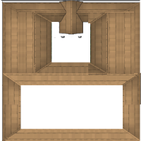
 Worldographer comes with an impressive array of Icons. However, I need Romanesque icons which don't appear to be a part of any set. I had to edit what I had into what I needed. Edits can be fairly rough depending on scale.
As you can see, these are pretty flawed, but on the scale of my map, the flaws are invisible. I created 3 domūs so I can have variety.
Editing Icons is a pain. Normally, one gets Icons via Inkwell Idea's Patreon but there are other sources such as their main website in the store tab and, believe it or not, DriveThruRPG. They have dozens of offerings on DriveThru.
I want to review all of these products, but the line started back in 2015 and there are literally dozens of them. What 'll offer today is a round of products from 2015 with a brief description. Each is available for $1.99. The artist is Keith Curtis and these items are transparent png files which can be used in a variety of mapping products.
Hexographer September 2015 Monthly World Map Icons (Any Editor)
Description: E1 lin eart for trees, forests, rockets, zombies, etc.
Hexographer October 2015 Monthly World Map Icons (Any Editor)
Description: Resources, hills, forested mountains.
Hexographer November 2015 Monthly World Map Icons (Any Editor)
Description: Whirlpools, resources, craters, crevices.
Hexographer December 2015 Monthly World Map Icons (Any Editor)
Description: More resources and detailed compasses.
Dungeonographer September 2015 Monthly World Map Icons (Any Editor)
Description: Bookshelves, character tokens and staircases.
Next time in this series, I'll look at the 2016 launches, hopefully coming to current by sometime in March.
One special note is that Worldographer actually started as several different products: Dungeonographer, Hexographer, Cityographer. Much of each of these different software packages in combined in Worldographer and you can import old maps into Worldographer with little fuss. Worldographer also has a free product, a Pro product and total package bundle. I was a such a fan of the software, I purchased the full pro bundle which included all of the older products. It was probably unnecessary, but I've enjoyed it. Much of the artwork on this website is done in Worldographer. I should probably do a review of it soon.
Friday, February 21, 2020
Tinkering with Worldographer Maps
Unfortunately, my website doesn't easily permit scaling of images, so they have to be downloaded to be properly viewed.
 |
| Domus A 1 inch to five feet |
 |
| Domus A half inch to five feet |
 |
| Domus A 1/4 inch to 5 feet |
 |
| Domus B 1 inch to 5 feet. |
 |
| Domus B, 1/2 inch to 5 feet |
 |
| Domus B, 1/4 inch to five feet |
Saturday, December 7, 2019
Worldobuilder By Inkwell Ideas for Maps
You can pick up new icon packs from Patreon, as monthly subscription. My campaign is Roman themed, so I haven't partaken in that yet. I did purchased the e1 Icon pack when I bough the software. It allows me to make maps that look a bit like the Greyhawk campaign map. I love it.
You can give it a try with very few limitations from the store section of their main site. The free version doesn't nag or limit you too much. It is mean to just give you a taste.
I can't help but tinker. My setting is a peninsula with a vast savanna, I needed acacia trees. The set of icons I had didn't have any, so I modified a regular tree into one using the GNU Image Manipulation Program.
It reminded me of modding Civilization Icons. You need a transparent background. Did you ever try that? I used to have great fun adding dinosaurs and Veritechs to the game.
Anyway, back to my campaign. I have a large Romanesque city. Romans lived in villas and apartments. The software had a half dozen choices, but I need to populate a massive area. Repetition stands out like a sore thumb, so I got modding.
In the first version of my city, the buildings looked very medieval. I decided to make the whole area more Roman by making most structures either ramshackle wooden or Spanish tile like.
You can see those Spanish like rooves from 35,000 feet. Nice.
Then I wanted new villas. Just two choices didn't give a lot of variety.
I now have 4 or five variations. Square or rectangular and so on. One thing I discovered while working is, if you leave the courtyard area transparent, you can trees and other structures to the yard. Nice touch. The other thing is you can use the software to flip, rotate and scale the same building so even a copy doesn't look exactly like the one next to it.
For my last trick, and this is completely outside of the scope of Worldographer, I decided to add my party.
It is completely useless for game play, but I thought it was a nice trick. I have two wagons and 5 horses, to match my party. If you zoom in too much, there is zero detail, so the trick loses it's charm. But I enjoyed giving it a shot.
Saturday, September 14, 2019
Inkwell Ideas, Worldographer Software
 |
| Worldographer map from this year. |
 |
| Hand drawn map from 2 years ago. |
Today I googled something and discovered that Inkwell is using some of my maps as examples.
I love that!
Wednesday, September 11, 2019
Session 3 preview - North Market
The southern row houses look ruder because they are older, not because the people that live there are poor. It was a slap-dash build for people looking to get into the city fast. As you can see, there are a couple of rich villas right in with the row houses, separated by some green space. This is just a little off of the center of the city, so its still high society.
I am really loving this software and this style of map. It allows me to cover huge areas quickly, so that I can spend a few minutes mapping each day.
Each area has it's own little story in my mind and I can come back and add details later. I am probably not making the best use of Worldographer using the battlemat like this, but this town is hardly organic. It is relatively sterile and uniform as opposed to a town that sprung up from a chance placement of one house, or town square.
Monday, September 9, 2019
Bird's Eye View of Worldographer Map - City of Nace
The City of Nace is made up of 64 insula, or blocks. I made a mistake by creating this as a battlemat. My reason was to have square blocks, rather than hexes. By completing a map in this fashion, what I will actually have is 64 individual maps. (Actually, 63 because the forum takes up two insula.) Each insula is 180 yards across, north to south and east to west. By the time I am done, my players will have over a square mile of gaming locations and I will have at least a vague idea of what is happening... everywhere.
I have barely scratched the surface of what Worldographer can do, but I figure this practice will help me master it someday.
Sunday, March 24, 2019
.jar files under XFCE, especially for Chromebooks
It's not a huge deal, but some versions of Linux simply have a checkbox. I like easy. The "hard way" of opening or running a .jar file is to open the terminal and type:
java -jar filename.jar
Not so hard, I guess. But what if I simply want to double click that .jar file and have it open for me? The command is:
chmod +x filename.jar
Reading the command makes me chuckle. "put the x in the box" is the command. Why not an easy little box. This is handy terminal usage information for all .jar files from Minecraft to Hexographer. One note on HexOgrapher is don't forget the little "o" between x and g. For whatever reason, I say "Hexgrapher" and then want to type it that way. It does not work, don't bother doing that.
I can't wait to review this software. It looks amazing. If you are wondering how you came to be here from MeWe, I am the author at These Old Games. The Unpwnd website is my tech site, which is not typically useful to RPG and OSR gamers. Not much can go wrong with pen and paper, so I like to keep them separated.
