Thursday, August 17, 2023

Throwback Thursday - The Anniversary Edition

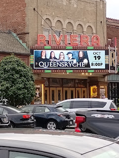
Today, Jen and I celebrated our 22nd wedding anniversary. As we had an excellent dinner and drinks, I noticed the Riviera Theater across the street was advertising bands that were big when we started dating. One of them really jumped out at me: 

Part of the evening was talking about vacation plans for next year. We are going back to Saratoga Springs, NY to see Dave Matthews Band. Due to COVID, a yearly tradition went in the garbage and now we are playing catchup. Jen would like to see DMB twice next year, back-to-back dates in Saratoga. 

We've seen them a lot and I accidentally derailed the conversation.

Jennifer said, "Man, we have seen DMB so many times. I bet you haven't seen the same band twice in two days." 

"Queensryche, 3 times in 3 days. I've seen them so many times," I said. 

She was flummoxed. "We've seen Dave Matthews 18 times. How many times have you seen Queensryche?" 

I started counting. As I got into it, it was easier to count cities by country than concerts. 

Buffalo, NY. 84, 89, 91 
Darien Center, NY. 95, 97
Weedsport, NY. 95 
Rochester, NY. 84, 89, 91
Blossom, Toledo, and Columbus, OH. in 1997, one time each. 

In addition to these dates, I saw them in Syracuse twice but don't remember what year. 

I could swear I saw them more in Canada than in the US, but I was wrong: 

Toronto, ON. 86, 89, 91, 95
Hamilton, ON. '88, 89
Ottawa, ON. 89*

* There was a second disastrous show in Ottawa where I ate the pizza at Mcdonald's. I puked my brains out at the show. So embarrassing because I didn't even have a chance to figure out the drinking age. It was a straight-up bad food choice. (It would have been 18 but for some reason, I forgot Ottawa was in Ontario.) 

You'll notice a funny thing about that list. I met my wife at the end of 1996 and we started dating in 1997. She missed the Queensryche years. When we met, she had only been to one concert. I decided to change that and one of our first concerts was DMB. 

So, if we go to DMB in July of next year, I will have seen Dave Matthews a little less than I have seen Queensryche. Thanks to my wife, by virtue of our metalhead daughter, I will get to add one more Queensryche tally to the list and keep that band on top for another couple of years. 

The more things change, the more they stay the same. 

Monday, May 29, 2023

Production Progress

Well, I have some artwork to share. Just a bit and not all of it for POP-001. Since I do not have much time to draw, I have to dedicate some time to practice. As spring goes to summer, I have even less time. To that end, I am pushing my release date to the middle of August. Can't be helped so I updated the countdown. 

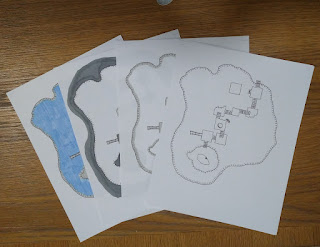
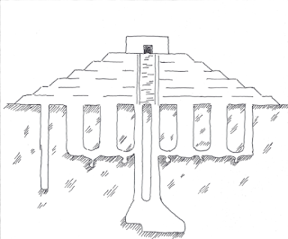
Anyway, the main feature of this project is a cenote. In order to make the art work for me, I broke it down into layers on paper so I could scan different parts as different layers. I can preserve my ability to change things up without resorting to "Fix it in post" crap.  

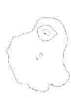
The first image is the extent of the waters. As you can see there is a small island with a cave in the image. I haven't decided if I will do color or not, but I might. The two odd features in the center are holes in the roof which provide access to the cen. There is no other way into this area.  

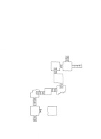
In order to get down to the water and rock shelf around it, characters will have to navigate a series of wooden platforms. There are two paths down, which are loosely based on both the movie Goonies and several amusement park attractions. 

This area would have been a daily trip for most people from the temple surroundings. Life-saving water plus a cool and relaxing place to hang out would have drawn every villager. The platforms are connected by ramps, but on one side there is a slide, and on the other is a floating platform for resting.

You can click each image to enbiggen them. 

One image will be overlayed on the other but there may be special cases where I want to separate them. A bonus map might be one cause. I was thinking of using the same art as a tiny dungeon. I will have to redress the walls, but it's doable. 

I've been practicing with several other images to get used to inking with new pens. 

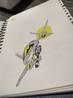
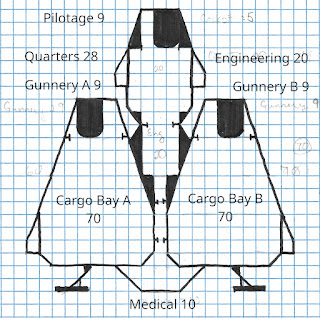
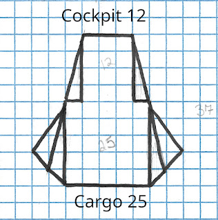
Many of these spaceships are copies of stuff from the Dynomo Joe comic series, while the last two are of a spaceship I designed for my Star Smuggler campaign.


This ship is called The Waterbuck and is nearly twice as larger as The Antelope class ship. When designing it, I thought about what a next-generation ship would have and would not have. This ship has the ability to mount 3 turrets. The one turret in the nose of the ship can be fired by the pilot as he or she flies. The other two need crew. The Waterbuck also has an advanced medical bay.  


What it does not have is a stasis unit or any concealed compartments. 

It also comes with a larger shuttle that can be carried externally or in one of the cargo bays. This shuttle has its own fusion drive and life support, so it can carry much more than the old shuttles. Older shuttles can still be used but they must be carried inside a cargo bay. 


As time permits, I will write up the details of both these ships. 

Monday, May 15, 2023

POP-001 - The Pantheon of Gods

I'm starting to piece together the Pantheon of Gods for the Lost Temple. It ain't much of a temple without a god or gods to worship. In this case, these gods became lost when the temple was abandoned so the PC's will not have any knowledge of them. 

The first god is going to represent liminal spaces. While he is not the most important God in the Pantheon, he is the vehicle behind the PC's ability to explore this magical place. Rather uncreatively, I've been thinking of naming him Lumo. I'll probably come up with something better. Lumo is a placeholder for now.

The term "liminal space" is new to me. This post is talking me through the idea. 

"Liminal spaces" refer to transitional or in-between spaces that are not easily defined or categorized. These are places where boundaries between different realms, states, or stages of being become blurred or permeable, creating a sense of ambiguity or uncertainty. Examples of liminal spaces include doorways, thresholds, bridges, crossroads, and shorelines, as well as certain times of day (such as dawn and dusk) or stages of life (such as adolescence).

This abandoned temple is somewhat like El Castillo, Chichen Itza. At least, that's what I've modeled the cover image after. I have come to discover that pyramids are really very boring as dungeons. They don't have many, if any rooms. El Castillo challenges my understanding of the pyramid dungeon as it was built on top of other structures. It does have interior spaces that have nothing to do with being a pyramid or temple. These would be an example of a liminal space, crossing from one time period to another or one function to another. 

Now this will require a modification of my original idea, adding long tunnels around the perimeter of the pyramid. These would serve as an entry point to the older temples, a sort of dungeon space, and a way into the vertical shafts. 

And Lumo has always been a part of this culture from the beginning. He is a prime mover here. Where these spaces exist, he is able to exist. 

In The Revenants of the Lost Temple, he will play a special, unique role in a modified wandering monster mechanic. The fun part of this is the player characters will have the ability to control the wandering monster rolls. It is simple and intuitive, while also creating an atmosphere of dread. 

I can't wait to get this thing released. I can't wait to create several other gods to join the heroes in their quest. 


Sunday, May 14, 2023

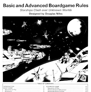
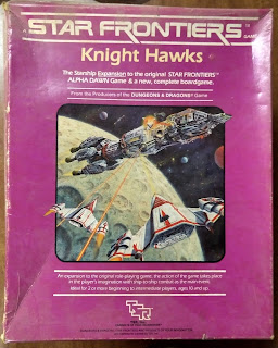
Star Frontiers: Knight Hawks Boardgame and Campaign Expansion Review

I have some more content queued up for POP-001, but I have to get some bugs out of my system. I did a review of Star Frontiers with the intention of returning to review the expansion set Knight Hawks. It's been 2.5 years, so I should do it now. 

Title: Star Frontiers: Knight Hawks Boardgame, The Campaign Expansion, and Warriors of Light Module
Designer: Douglas Niles
Year: 1983
Pages: Boardgame book, 20 pages. Expanded book, 64 pages. SF0, 32 pages.
Number of players: 2+
Rating: ★★★

Star Frontiers is a classic science fiction role-playing game that was first introduced in 1982. One of the most exciting aspects of the game is the Knight Hawks expansion, which focuses on ship-to-ship battles. This expansion provides players with an opportunity to engage in space combat, which is a crucial element of the science fiction genre. This set was a boxed set like Alpha Dawn and even follows the exact same book and page count as the original. 

The key features of the Knight Hawks expansion are the ship-to-ship combat and ship design system. Players have the ability to design their own spacecraft from scratch, giving them the freedom to create vessels that suit their playstyle. The ship design system is complex but rewarding, allowing players to customize every aspect of their ship, from its weapons and defenses to speed and maneuverability. Plus every part of the customized starship simply works with the ship-to-ship combat system right out of the box. 

Players don't need to create ships to engage in ship-to-ship combat, the module will gift them with not just their own ship, but a whole fleet of ready-go ships. The combat system is turn-based and consists of three phases: movement, combat, and damage control. The phases are crucial for setting up attacks and avoiding incoming fire so as not to resort to damage control.

The combat phase is where the action really heats up. Players can choose from a variety of weapons, such as lasers, missiles, and torpedoes, to attack their opponents. Each weapon has its own unique characteristics, such as range, damage, and accuracy. 

The game uses what I call a Chocolate, Vanilla, and Strawberry system of weapons and defenses. There are missiles, lasers, proton beams, and electron beams. I seem to recall neutron beams, but I think stole that from Starfire, another excellent game from the time period. Specific attacks are modified or negated by specific defenses which creates a wild dynamic where ships might have the WRONG type of firepower. As confusing as the terms are, there are only three or four so you can roll with it pretty easily. 

There is a damage control phase, where players can repair any damage their ship has sustained during combat. This phase is vital, as a damaged ship is less effective in combat and can be destroyed more easily. Players can repair damage to their ship's hull, engines, weapons, and defenses, but doing so requires time and rolls against the DRC rating of the ship. It is far less complex than StarFleet Battles and can be adapted to be more Traveller-like by ignoring the DRC for some aspects and allowing characters to use their new starship skills to get stuff done. I wouldn't suggest making every repair a character skill roll, but the nugget of the idea is there. 

I play StarFleet Battles, so I can't call this set complex or deep, but it has Basic and Advanced rules can get new players going with minimal fuss. Was I to stop the review here, the boardgame rules are stand-alone and would get 5 of five stars. 

You'll notice that I gave this set 3 stars. That is because the integration with Alpha Dawn sucks. In Alpha Dawn, we left the characters with 3 PSAs with a max of 6 ranks. Knight Hawks throws in 4 more Star Ship Skills which are not PSA, but dependent on PSA. And require them to be nearly maxed out. 

What?  

On day one of purchasing the box set, you are months away from having your old characters gain the necessary skills to use this set. That's garbage. What does firing a gyrojet weapon at a tank have to do with lobbing a giga-ton nuke at a ship in orbit? Driving a car is related to jumping a spaceship? No. That shouldn't be a thing. 

I could explain the way I handle this hitch, but instead, I will ding this set 3 stars and allow you to engage with your players as you see fit. I WILL give this set one additional star for adding more vehicles and space combat into the mix while resolving the chronic "First World Star Frontiers Problem". 

What I call the First World Star Frontiers Problem is a lack of creativity in the creation of modules. It is really a problem of having too many options or possibilities available in the rules and settings hampering an author's ability to create an engaging scenario. Virtually all of the modules lay out a scenario, then strip the players of some or all of their weapons and kit. That is a systemic railroad if I ever saw one. 

Don't do that to your players, do anything else. 

Knight Hawks actually fixes this problem as even lifeboats have guns and ammo, tools are weapons and the ship is a flying storehouse. Giving the characters a massive starship basically means if they lose their gear, they go back to the ship and gun the f--- up, and come back with a vengeance. This is a better playing experience than losing it all and coming back from nothing. Half of the game is shopping for kit or designing spaceships. Why bother striping gear for every pre-packaged adventure? 

In conclusion, Star Frontiers Knight Hawks is an adequate expansion that adds a new dimension to the already good Star Frontiers RPG. The ship-to-ship battles are engaging and challenging, requiring players to think strategically and use their resources wisely. While the system may be overwhelming at first, the rewards are well worth the effort. If you're a fan of science fiction and role-playing games both halves of this system are for you. 

You can pick up a copy on DriveThruRPG either in PDF or Print. Either is very nice and the two boxed sets are combined together, so it's just one purchase. Personally, I would buy the combo PDF and Print set so you can print off as many of the map pieces and counters as you like. Star Frontiers has really nice counters and starship deckplans. 
Wednesday, May 10, 2023

Artwork Update - POP-001

Over on Ko-Fi, I am working on POP-001. This takes place in a lost temple. The artwork for that appeared here several years ago. I didn't mean the maps to be a module, but when I discovered that it survived the fire, I decided to go for it. 

These images are very spare and were not meant to be a dungeon. Through the magic of digital media, I can actually adapt them to what I need them to be. Once complete, you will be able to see the original artwork at the same time as seeing how it was adapted for this title. 

Right now I am working on the main battle map, the cenote chamber. For this map, I need to deviate from the simple one-marker, black-and-white design without moving too far from it. This is for clarity.   

You'll have to check out my Ko-Fi posts for the complete ideation of what is to come from this module. What I'd like to write about is my process. 

A lot of times, people will get cagey about tracing stuff. Well, don't be. 

If you look at the 4 images above, they are digital combinations of 3 images that were traced. Granted, they were traced from my own original work, but this is an old-school version "fix it in post". If you zoom in, you'll notice that the gradient lines of the shoreline are exactly the same because it's a scan. With a lightboard and tracing, it would almost impossible to match the lines over and over again. 

At least for me, because I have a tendency to right to ink, no pencil at all. Usually, to create such things I do pencil on graph paper, then trace right to ink. The image is already set on the underlayer, so why not? 

Interestingly, this type of image can be turned sideways for elevation or twisted by some math to give a 3/4 view or whatever I decide, all on paper before the digital process starts. 

My goal is to generate different layers on paper then scan, then combine so I can have multiple images in a variety of styles. This mixed-style allows me to edit stuff digitally to output documents in 8.5x11", A4, or A5 and 5.5x8.5 booklets.  

As I get closer to completion, you'll see more art from me. However, at the end of the day, you'll want to follow me on Ko-Fi to see more of the behind-the-scenes stuff that didn't make the final cut.